My Somewhat Unconventional iPhone Home Screen
My iPhone set-up attempts to maintain two axes of symmetry: horizontal symmetry is achieved by restricting icons to three screens, with my centre screen as a primary default view, and its adjacent screens on either side identically laid out; I get vertical symmetry on the centre screen, but have to acquiesce to efficiency on the other screens, which have two rows on top and one in the tray. On the fourth screen go apps that I’m developing, which creates an imbalance, but can’t be any other way.
Tray
My most accessed apps. Only Apple apps are allowed in the system tray.
Centre
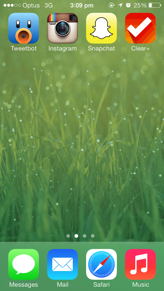
My ‘home’ screen—that is, my most visited screen—isn’t the first page of the iOS home screen list; I use the middle screen of three app pages, because it gives me fast access to other pages of apps, without feeling claustrophobic. It has never made sense to me why power users have a linear screen ranking (i.e. most important apps on the first screen, second tier on the second screen, and so on), rather than having the centre screen as the top rung, and branching off from there, which minimises horizontal swipes to access your least-used apps.
Top-left, my premiere app slot, goes to Tweetbot, because I use it slightly more often than anything else, and it has a lovely icon. I resisted buying the old version, mostly because I thought it was over-designed. I still have problems with the current version: I don’t understand why there needs to be a search bar at the top of each scroll view in the app. The app’s great in almost every other way. I can’t wait for an iPad version.
Instagram, which needs an updated icon, comes next, followed by Snapchat and Clear. I use Clear for short notes, reminders and obviously todos; Downcast and Clear battle for the top-right slot regularly, but when I need to access Clear, I need to do it quickly. I generally open Downcast in a much more recumbent position. It’s a shame that I have to use Clear Plus in order to have sync and parity between my iPhone and iPad, but that’s an unfortunate consequence of Realmac splitting their app versions.
Right
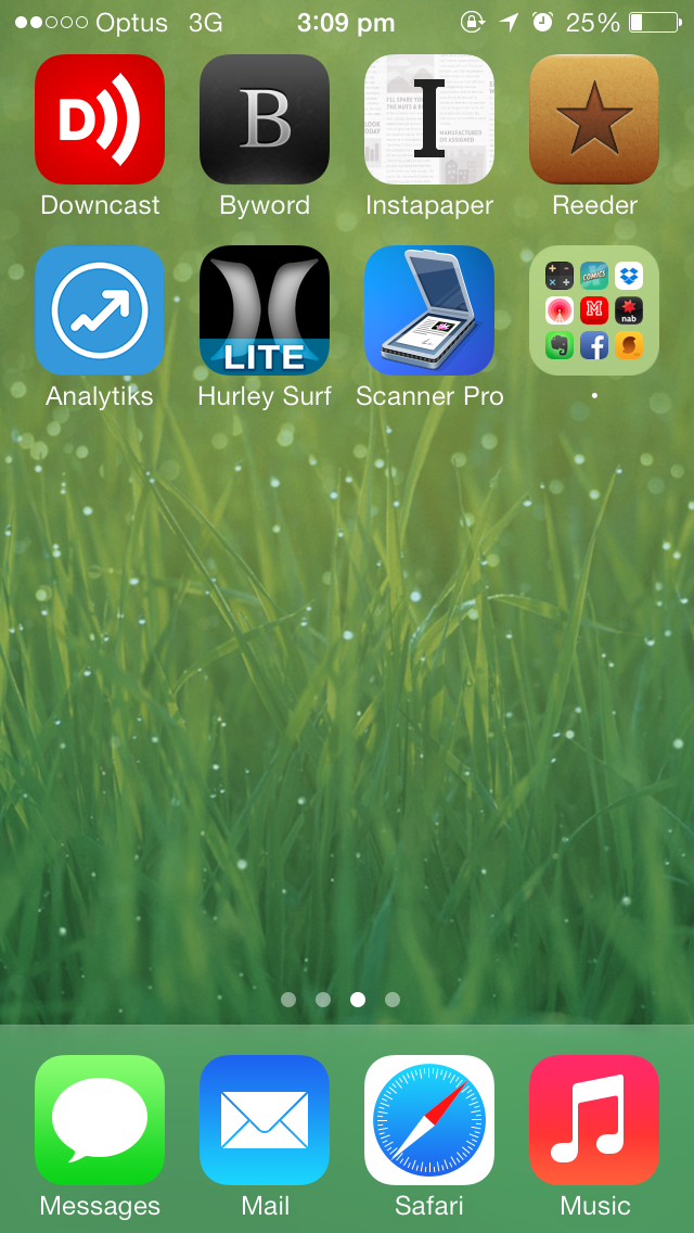
Ranked from top-left to bottom right, in order of frequency and quality, these are my third party apps.
Downcast, which I touched on above, is likely to be replaced by Overcast when it’s released, depending on how much Marco cuts from 1.0 (I read that there would be no support for streaming—deal breaker).
Byword is for notes, synced between iPhone, iPad and my Mac with Dropbox. I’ve symlinked my Mac’s Documents folder to Dropbox, so I can save documents to Documents and have it sync, which feels far more copacetic.
Things go into Instapaper, and I read the things.
Reeder is my RSS client. I should update it to Reeder 2, but I don’t think there’s enough of an update yet. An IFTTT recipe lets me star items in Reeder and have them sent to Instapaper. I sync with Feedly.
Analytiks is a lovely analytics app for Google Analytics; I wish there was an iPad version.
Hurley Surf is a pretty average way of checking surf reports and forecasts. It does the job.
Scanner Pro amazes me with how well it works. I was a little disappointed because I bought it a few days before it was featured as App of the Week and made free. I scan documents and they are automatically uploaded to Evernote. Evernote’s OCR is pretty great, and lets me search through scanned documents quickly.
Bottom right, I keep a junk folder of apps I need on my phone, but don’t want to look at with any regularity. Keeping apps in a folder is faster and neater than having several screens of miscellaneous icons splayed everywhere. Though it isn’t quite as fast as Spotlight search, I like the folder system because it prevents me needing to skim and swipe past rows and rows of apps when I’m in a rush. It’s easy to find apps in exigent circumstances, and other apps, which are opened with less urgency, go into the folder. There are a few apps I’d like to promote out of the folder, but not enough to justify moving to a five-screen layout.
Left
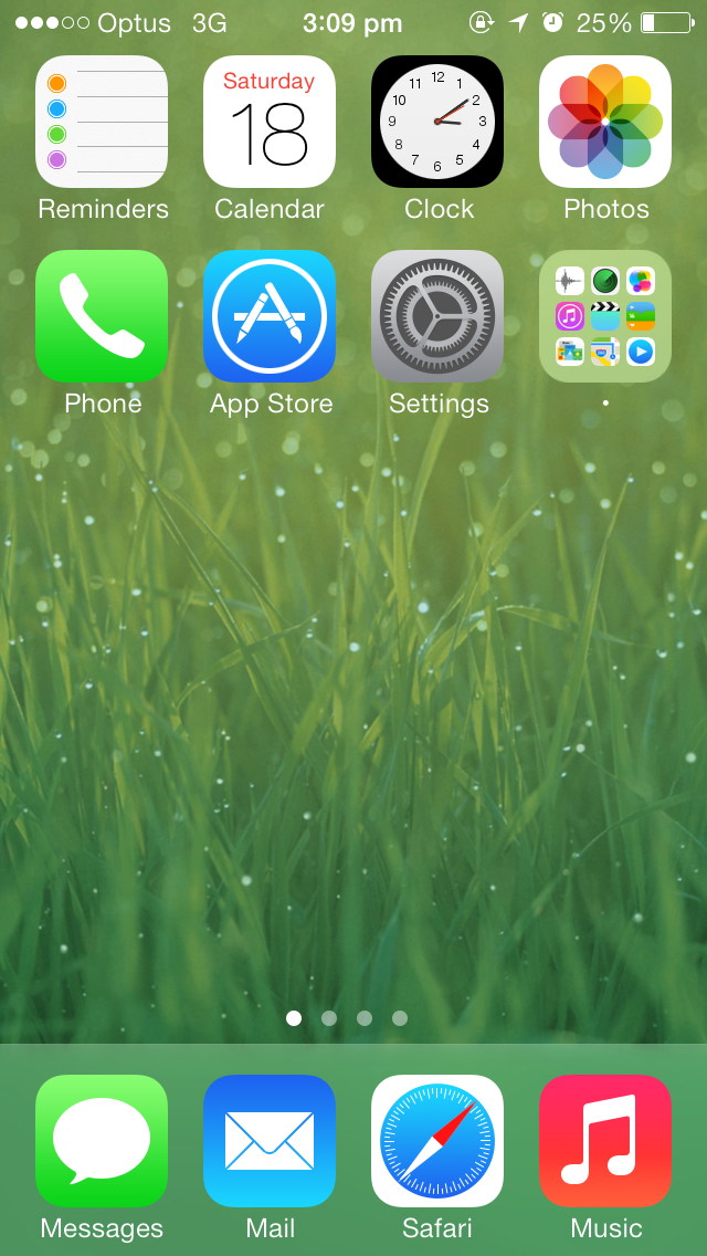
I keep system applications on the left. I try to stick to default applications as much as possible—I’m enamoured with the notion of a developer-designer-auteur. I romanticise someone with a single, overarching vision for an OS, and thus I want to try exactly what that fictional person had in mind (I used to envisage Steve Jobs).
I’m close to replacing Calendars with Fantastical, but I dislike Fantastical’s white-black contrast, an effect I also dislike in Tweetbot. Reminders is rarely used—it should probably be relegated to the folder or lower in the hierarchy. Clock, Photos, Phone, App Store and Settings are irreplaceable. Another filled folder, replicating the pattern on the right.
Simplicity through restriction
Having such a rigorously restricted layout for apps makes finding things fast. I don’t need to process each app’s icon—I have developed a certain muscle memory for most apps—and having fewer rows mitigates the chances of mis-tapping an area of the screen. It’s more minimalistic as well. Having to limit my app places also prevents me installing every junk app I can get my hands on, which would drag me further into the pit of clutter. Though I have some weird habits and preferences, I find the consistent pattern relaxing, simple and fast—my top priorities for an app launcher.
💅 Vanilla – hide icons from your Mac menu bar for free
🚀 Rocket – super-fast emoji shortcuts everywhere on Mac… :clap: → 👏
⏳ Horo – the best free timer app for Mac
📂 FastFolderFinder – a lightning-fast launchbar app for folders and apps
📖 Kubernetes – my book on Kubernetes for web app developers
😄 Emoji Bullet List – easily emojify your bullet point lists (like this one!)
Jump on my email list to get sent the stuff that’s too raunchy for the blog.
(Seriously though, it’s an occasional update on apps I’ve built and posts I’ve written recently.)